Thank you for your sharing. I am worried that I lack creative ideas. It is your article that makes me full of hope. Thank you. But, I have a question, can you help me?
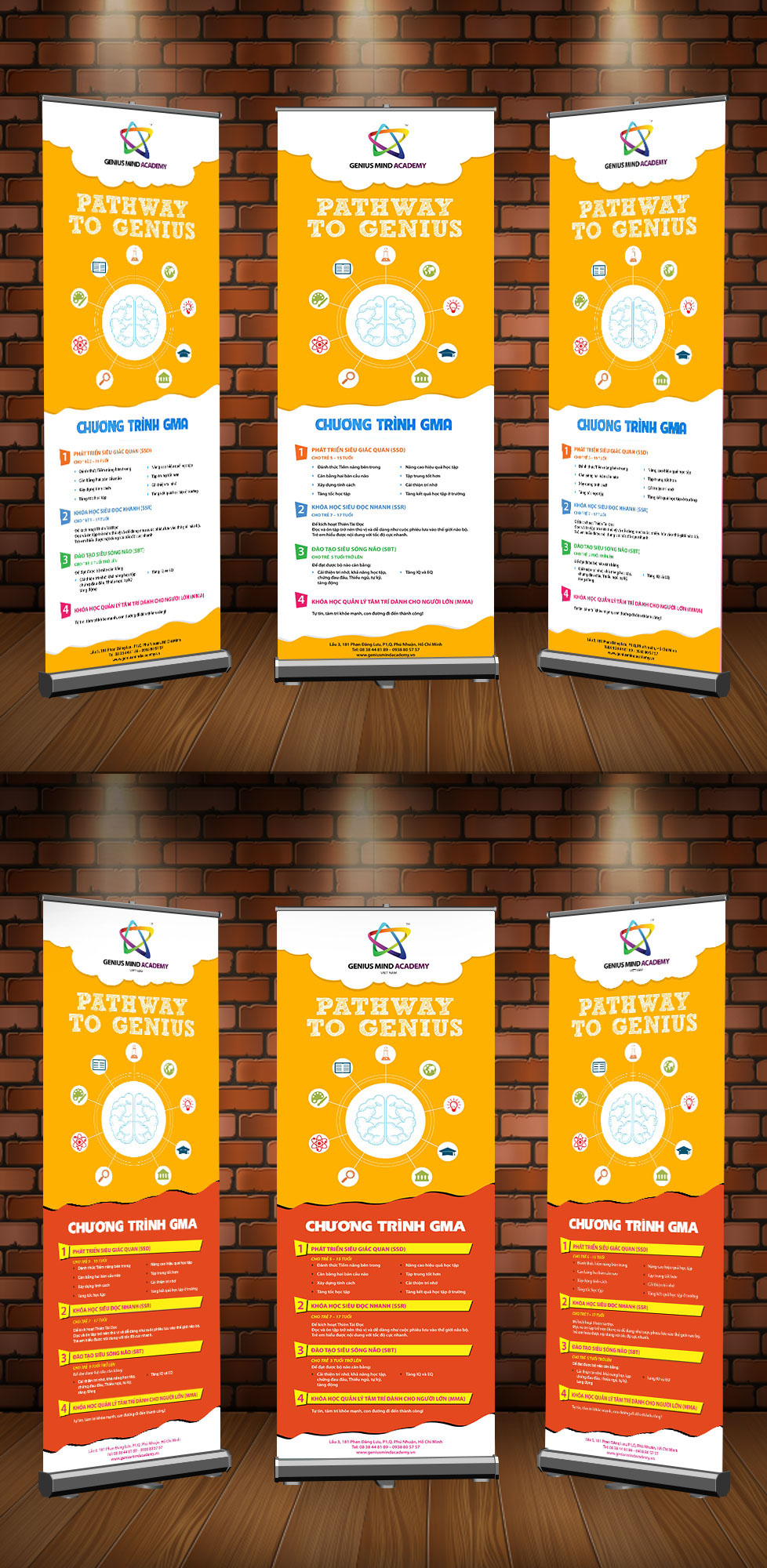
Yellow works really well for education displays bright enough to catch attention without feeling overwhelming. A vertical rectangle like this fits neatly in a classroom corner or hallway without taking up much floor space.
Thiết kế standee giáo dục với tông màu vàng nổi bật mang đến cảm giác trẻ trung, chuyên nghiệp và rất thu hút ánh nhìn, đồng thời bố cục chữ nhật đứng giúp truyền tải thông tin rõ ràng, tạo ấn tượng mạnh mẽ và phù hợp cho các chương trình quảng bá, tuyển sinh hoặc sự kiện giáo dục hiện đại và sáng tạo.
Thank you for your sharing. I am worried that I lack creative ideas. It is your article that makes me full of hope. Thank you. But, I have a question, can you help me?
The yellow color really makes this standee easy to notice, specially for education events where there are already too many posters around. But maybe adding a little more white space could make the text easier to read from far away. I’ve seen some standees look nice close up but confusing at distance. The bright style works good for students tho, it catches attention very fast without looking too serious or boring.
What i find interesting is how such designs combine simple messaging with strong visual appeal , specially in education, where clarity and motivation matter more than complexity, even a well-designed standee like this can make information feel more inviting and less formal, which is important in student-focused environments.
The colorful educational standee design looks very creative and eye-catching. The bright style makes the content more engaging and attractive for viewers. It’s a nice example of modern visual presentation that can easily capture attention and create a lively atmosphere.
This site is very user friendly even for beginners. I appreciate the clear layout and the fast loading times. 998jilicom is definitely worth checking out.




Thank you for your sharing. I am worried that I lack creative ideas. It is your article that makes me full of hope. Thank you. But, I have a question, can you help me?
Thanks for sharing. I read many of your blog posts, cool, your blog is very good.
Can you be more specific about the content of your article? After reading it, I still have some doubts. Hope you can help me. https://accounts.binance.info/pl/register-person?ref=UM6SMJM3
Thank you for your sharing. I am worried that I lack creative ideas. It is your article that makes me full of hope. Thank you. But, I have a question, can you help me? https://accounts.binance.info/es/register-person?ref=RQUR4BEO
Can you be more specific about the content of your article? After reading it, I still have some doubts. Hope you can help me. https://www.binance.bh/da-DK/register?ref=V3MG69RO
Yellow works really well for education displays bright enough to catch attention without feeling overwhelming. A vertical rectangle like this fits neatly in a classroom corner or hallway without taking up much floor space.
Thiết kế standee giáo dục với tông màu vàng nổi bật mang đến cảm giác trẻ trung, chuyên nghiệp và rất thu hút ánh nhìn, đồng thời bố cục chữ nhật đứng giúp truyền tải thông tin rõ ràng, tạo ấn tượng mạnh mẽ và phù hợp cho các chương trình quảng bá, tuyển sinh hoặc sự kiện giáo dục hiện đại và sáng tạo.
Thank you for your sharing. I am worried that I lack creative ideas. It is your article that makes me full of hope. Thank you. But, I have a question, can you help me?
The yellow color really makes this standee easy to notice, specially for education events where there are already too many posters around. But maybe adding a little more white space could make the text easier to read from far away. I’ve seen some standees look nice close up but confusing at distance. The bright style works good for students tho, it catches attention very fast without looking too serious or boring.
What i find interesting is how such designs combine simple messaging with strong visual appeal , specially in education, where clarity and motivation matter more than complexity, even a well-designed standee like this can make information feel more inviting and less formal, which is important in student-focused environments.
The colorful educational standee design looks very creative and eye-catching. The bright style makes the content more engaging and attractive for viewers. It’s a nice example of modern visual presentation that can easily capture attention and create a lively atmosphere.
Thanks for sharing. I read many of your blog posts, cool, your blog is very good. https://accounts.binance.com/pt-BR/register-person?ref=GJY4VW8W
Can you be more specific about the content of your article? After reading it, I still have some doubts. Hope you can help me.
Thanks for sharing. I read many of your blog posts, cool, your blog is very good.
Your point of view caught my eye and was very interesting. Thanks. I have a question for you. https://accounts.binance.bh/register/person?ref=GGYHGRE
This site is very user friendly even for beginners. I appreciate the clear layout and the fast loading times. 998jilicom is definitely worth checking out.
Thank you for your sharing. I am worried that I lack creative ideas. It is your article that makes me full of hope. Thank you. But, I have a question, can you help me? https://accounts.binance.com/register/person?ref=IXBIAFVY
Best experience so far! The bonuses are actually fair and the payout process is way faster than other sites I’ve tried. Cheers to phjlpgcasino!
Can you be more specific about the content of your article? After reading it, I still have some doubts. Hope you can help me. https://www.binance.bh/uk-UA/register?ref=XZNNWTW7
Your article helped me a lot, is there any more related content? Thanks! https://accounts.binance.bh/register/person?ref=QCGZMHR6
The graphics are great and the gameplay is very exciting. Definitely one of the best platforms out there phtaya7774.
Thanks for sharing. I read many of your blog posts, cool, your blog is very good.